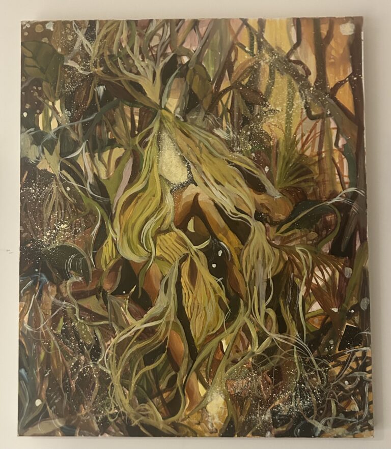
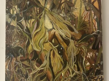
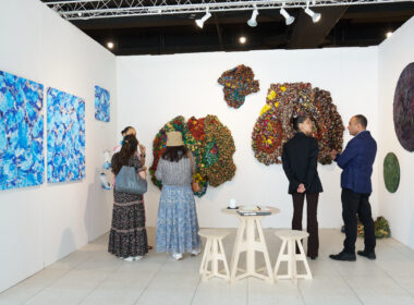
Above: Photo taken by Evaan Jason Ferreira
Wynona Mutisi is an emerging artist from Harare, Zimbabwe. Her multidisciplinary practice includes printmaking, graphic design and illustration. Her work is inspired by the Black women in her life. She has co-curated a few shows in the past few years. In this conversation with Barnabas Ticha Muvhuti, she talks about her recent online graduate exhibition, the commercial aspect of her work, her choice to focus on Black women, and the future of graphic design in her country of birth. Wynona is currently a fellow at the Mail & Guardian Africa’s The Continent weekly newspaper.
Barnabas Ticha Muvhuti: Congratulations on attaining your Bachelor of Fine Arts (BFA) degree. You were part of the first group at Rhodes University to present your final exhibitions online due to the pandemic. How was the experience?
Wynona Mutisi: Thank you! I would say it was surreal. I mean, from the moment you start doing fine art in your first year, you anticipate having to curate and pull off a physical exhibition. It is what we are trained for. Then, there’s the excitement of meeting with your peers, lecturers, family and others in Art School to launch the One-Night-Only experience of the graduate exhibition.
That did not happen for our group. In fact, it presented an opportunity for us to do something we had never done before; that is, to have our graduate exhibitions last longer than a night. Suddenly the ephemerality of it was removed and more importantly, we had more reach. Anyone anywhere in the world could experience our work without having to travel to Makhanda. I also found an alternative solution to my work, which made it end up being an entirely digital interactive experience. I feel that had we not been going through a pandemic, my solutions would bring a different outcome, one that caters to the possibility of people gathering and physically interacting with my work.
BTM: I found your interactive exhibition quite thoughtful and informative. Would you please explain what it’s about?
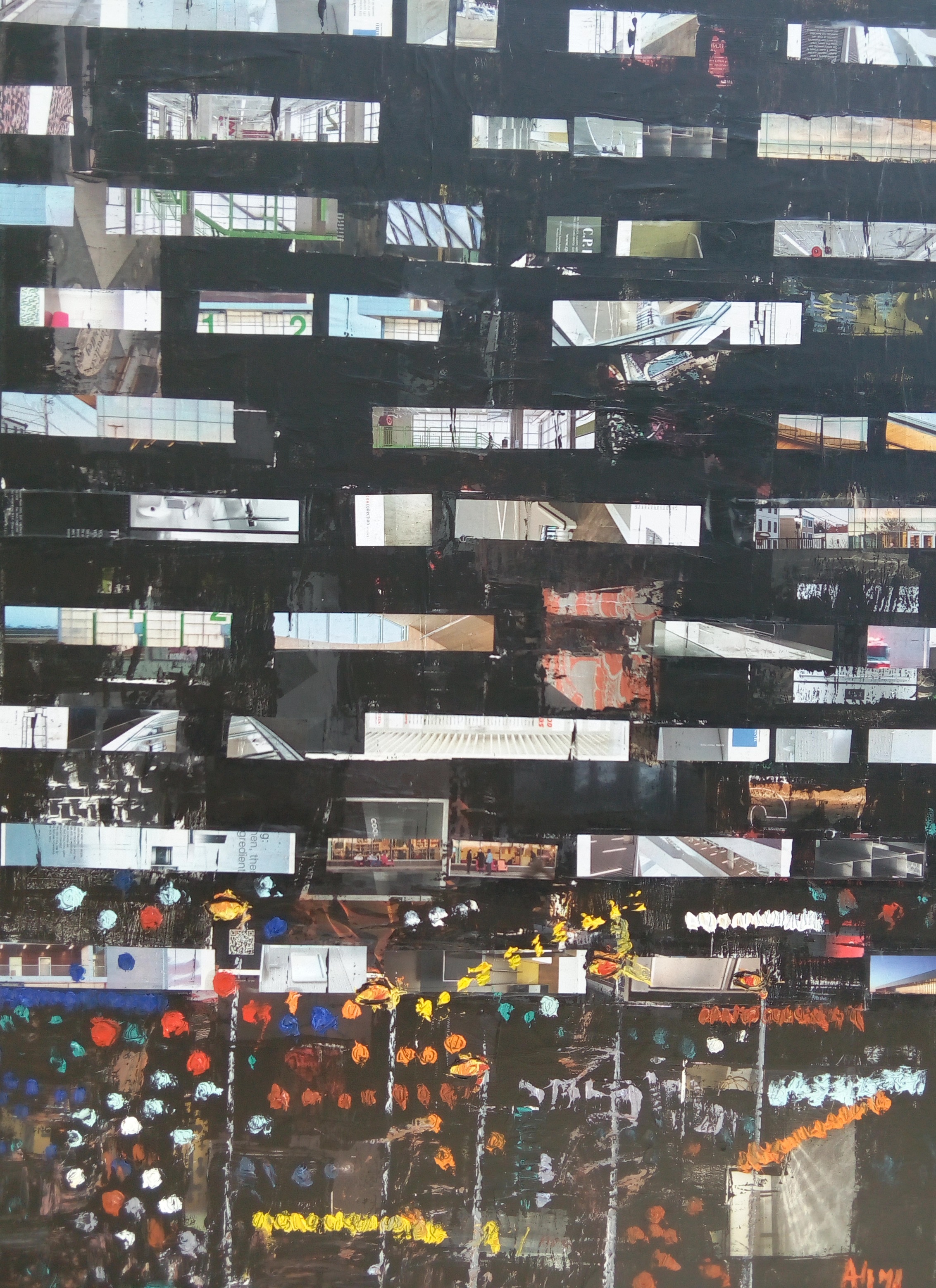
WM: My exhibition’s title is Kumba which is Shona for “home.” It was born out of me wanting to see how far I can push making commercial art work within a fine art context. The main idea was to maintain the function of design and adding layers of meaning to it. I made product packaging designs, and I also designed maps, which all played a role in exploring the idea of home. Home is often thought of as singular, and while my work grapples with the efforts of growing roots in a particular home, the overarching theme is of displacement.
Kumba brings forth the experience of home through package design and mapping. It hinges on the idea that home is not just a physical place but an experience. My family has moved around a lot, so the maps depicted the five different homes we lived in in Harare. Each one had its own set of experiences relating to the currency we were using at the time, security, distance from school and the city, service delivery, etc. From those experiences, I then created fictional products and packaging to encapsulate the concept.
For example, one home was in Mabelreign and it was titled Kuma Dale Dale, which loosely translated to “the suburbs” in Shona slang. I created seed packaging as an ode to the garden my mother started, because we now had space. Apart from growing flowers and herbs like all the families in the neighborhood, my mother was also growing vegetables to supplement the lack of food products in the shops between 2007-2008. The maps were a way of getting a sense of the location/space, giving insight and allowing the viewer to “travel” without leaving their computer screen. While navigating through the mundane facts of life as experienced by my family and me, the viewer learns of key issues affecting a broader view of life in Zimbabwe.
BTM: Your mother, sister and cousin were part of the project. How important was it to collaborate with family, and how was the experience?
WM: Collaborating with my family was an essential part of the project. Initially, they did not understand why it was important and why it mattered that I wanted to know each of their experiences in the homes we’ve lived in over the years. More importantly, their involvement drove home the narrative I was constructing; four women navigating surviving domestic trouble, economic hardship and social instability in Zimbabwe. My intention was to emphasize on the feminist saying, “the personal is political” by showing how my family’s experience as females is not divorced from larger systemic relationships of power, be it in the government or the lack of the construct of the “head of family” character in the form of a father. Working with my family allowed us to reflect on how far we had come along just as we were and where the system failed us. We reflected on our vulnerability and also the strength we gained to endure.
BTM: You make a distinction between your fine art practice and the commercial aspect of your work. Can you expand on that?
WM: The Rhodes School of Art exclusively teaches fine art and not commercial art practice. It’s not a problem at all, it just prompted me to ask why that is, and there was the subsequent revelation of fine art being regarded as “high art” traditionally and commercial art being reduced down to a skill. There’s an obvious art historical problem that has separated the two and given higher value to one over the other, and so I sought to create room for where the two could be made distinct without placing greater value on one.
I am a self-taught designer and illustrator, and as I taught myself while pursuing my degree, there was always a conflict between the two when I tried to mix them. It’s only up until I started stretching the function of commercial work and adding fine art concepts to it that the lines between the two began to blur as evidenced by my graduate project.
However, I have been realizing how that not only worked within the university institution but outside in the working world. For example, there are clearer distinctions. I have chosen to highlight the disparity for its resourcefulness. What I mean is, after four years of an undergraduate degree, I did not just emerge as a fine artist, but I also came out as an illustrator and graphic designer. The range has allowed me to enter spaces that Wynona the fine artist may not necessarily have been able to enter. Making the distinction between my fine art practice and commercial art practice acknowledges the difference, but also allows me to wear many hats and fit in various creative spaces.
BTM: You have curated shows in the past? How did you find the experience, and is it something you would do in future?
WM: I have only co-curated one exhibition in the traditional sense of hanging artworks on white walls in a gallery space. I titled it, Body | Bodies | Bodied. And before that, I co-curated a couple of laughter workshops that focused on laughing as an art form. The laughter workshops ran under the title, R U Laughing? Body | Bodies | Bodied explored what a body meant, referring to a body as a collection, body as an object and body as a concept. The exhibition became an opportunity for us to stretch and include work that would otherwise have been dismissed as not being “fine art enough,” these were Danielle Larratt’s character illustrations. Through her illustrations we explored how the body is perceived in imagination.
The exhibition was only up for a night in the Rhodes Art School side gallery. Apart from the reports each contributor wrote as part of a student initiative portfolio, there is little to say about whether the exhibition was archived. The point of it was to mirror the tradition of the graduate exhibition that would only be up for a single night.
The laughter workshops we held were an unconventional idea for an exhibition. They took place in the drama department. We focused on our attendees being both the creators and audience. We facilitated several laughter exercises that focused on movement and sound. It was physically intense, yet also calming for the mind. We were driven towards art also being read as entertainment and a way to wind down. We held laughter workshops for two consecutive years, and they were each one-night events as well.
We purposely did not document or archive them, because that was another concept we were exploring, of whether people only acknowledge that art was created when they can physically see it. It drew from performance art theories, particularly referencing performance artworks that were not recorded. The people who attended the laughter workshops are our archives, and all we have left is a testimonial of how it happened.
Curating both these events was quite a challenge but one that I enjoyed. At the time, I had imagined that it would be easier for me in the future to be a curator as opposed to a practicing artist. I still have curating on a list of things I am interested in taking up; however, it is no longer my sole priority. It is what I knew then, and now I have been more exposed to a broader creative world and finding jobs and positions I did not know existed or rather ones I didn’t know were open to fine art graduates.
BTM: Would you also like to say a word about the Black women in your work?
WM: The Black women in my work are as real as they come. They are not performing the trope of what Black female characters who’ve been through trauma should be; that’s strong with a thick skin. They are vulnerable in their positioning as females in this climate but still optimistic. They endure, even though it’s difficult, and they acknowledge that they are weak sometimes. They believe that they can forge a reality in which they are content, and it starts with taking back their power by resisting the economy, the society and the politics’ constructs.
BTM: How do you see the future of graphic design art for Zimbabwe?
WM: There is a big future ahead for graphic design in Zimbabwe. I have had the pleasure of engaging with other Zimbabwean graphic designers who have gone through institutions different from mine, but all recognize the importance of asserting a design language unique to the Zimbabwean experience.
Overall, I am hopeful about the future of graphic design in Zimbabwe. I believe that it will occupy spaces that allow for critical thinking in as much as it cares for aesthetics.
Graphic design that takes the form that my graduate showcase took is what I am unsure about. I have not yet come across many artists working in the same/similar way that I do, so I cannot project what the future looks like in that area. I do think though, that if more people access my work, others can get inspired and find new ways to evolve the type of work that I do.
BTM: Who or what inspires your work?
WM: I think of my work as a slice of life, and so, by virtue of just being alive and living, I draw inspiration from that. I also think that there are so many things to be learned from people’s personal experience, and it matters when we can critique serious issues through art that have been drawn from personal experiences. Moreover, the women in my life inspire me. My nuclear family structure is matriarchal, and seeing women take control of their narrative and building an ideal world for them is hugely inspiring.
BTM: What lies ahead?
WM: At the moment I am a fellow at Mail & Guardian Africa’s The Continent weekly newspaper. I do layout design and illustration for them. It is really heartwarming to know that what I acquired in my fine art degree can be applied elsewhere, and in this instance, it is journalism. I am hoping to return to Rhodes University to pursue a Master of Fine Art degree soon. I want my master’s to be an extension of the work I began in my undergraduate degree. I want to push towards world building; to have my family construct a desirable Zimbabwe to live in based on past experiences.
When I am not working at The Continent, I am working on independent projects, mostly illustrations. If I am being honest, I am not quite sure what I want to do in the future. Before I completed my undergraduate degree, I had my heart set on curatorial practice, but now that I’ve been working at The Continent for a little bit, I have become exposed to opportunities I never imagined were possible. I am certain though, that whatever it is I decide to do in the future will most certainly be creative and will ensure that I grow my practice.
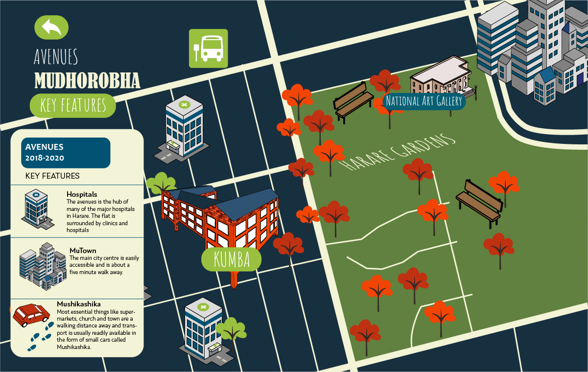
Above: Avenues – Mudhorobha | digital map illustration and design | 1,201 X 760 pixels | 2020
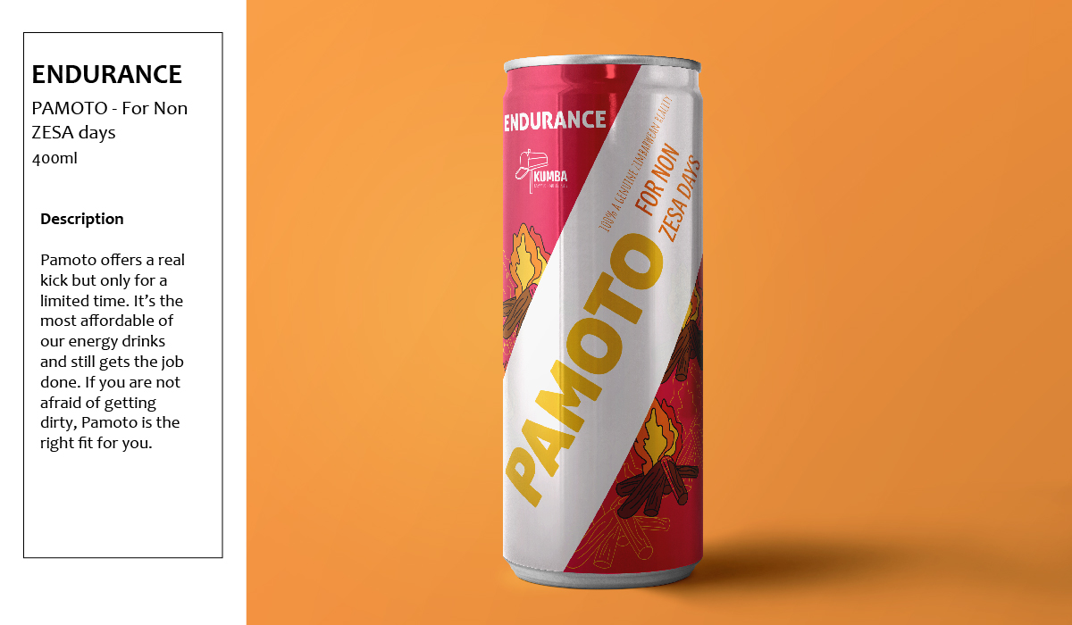
Pamoto – Endurance | product package design, illustration | 1,200 X 700 pixels | 2020
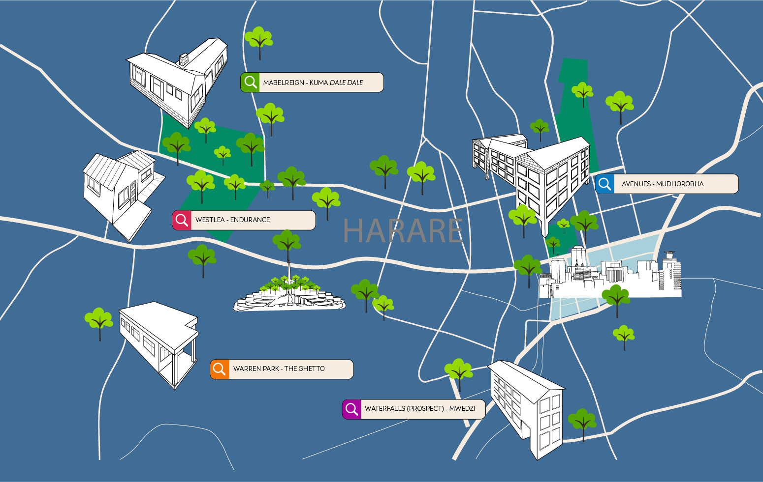
Above: Harare Map | digital map illustration | 1,550 X 981 pixels | 2020
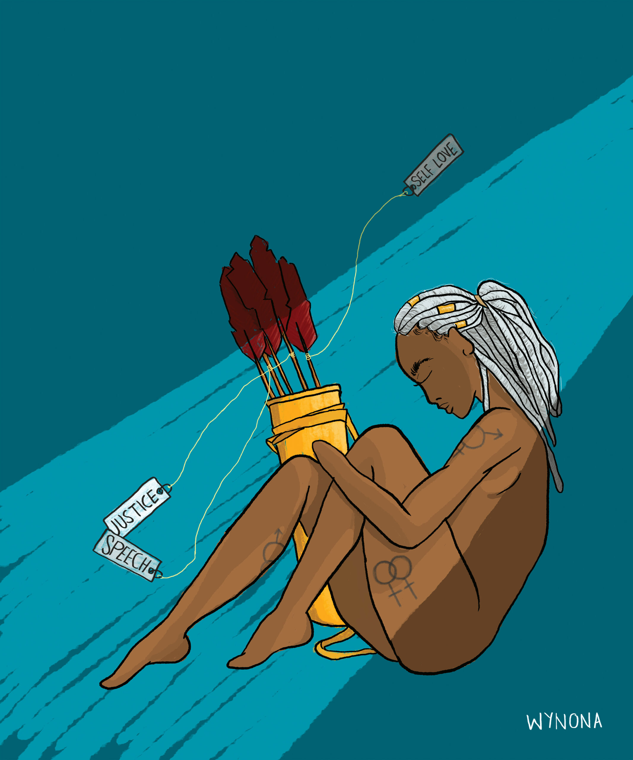
Above: Without Her Bow | digital illustration | published in Buwa! A Journal On African Women’s Experiences (Issue 10, April 2020) | 3,543 X 4,252 pixels | 2019
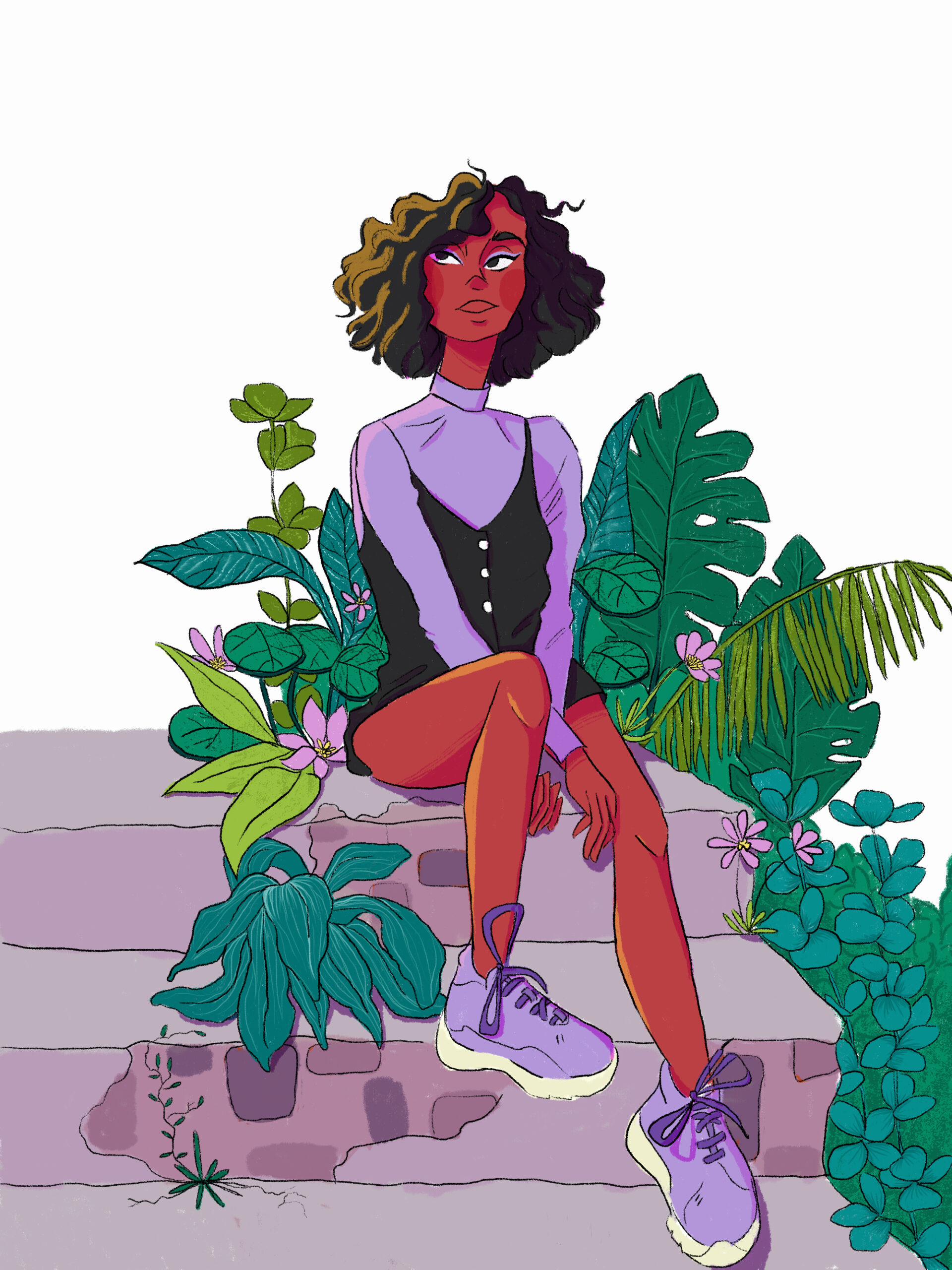
Above: Leago in Makhanda |digital illustration | 2,000 X 2,662 pixels | 2020
All images supplied by Wynona Mutisi.
Wynona Mutisi is a Master of Fine Art student majoring in art history and visual culture and fine art practice at Rhodes University.
Barnabas Ticha Muvhuti is a Ph.D. candidate in art history in the NRF SARChI Chair program in geopolitics and the arts of Africa, Rhodes University.